Plotting phase differences (circular plots)
Contents
Plotting phase differences (circular plots)#
The standard way to represent event-based data is linearly; we plot the events with time on the x-axis. When we compare two sequences, say the stimuli and the responses from a finger-tapping experiment, often we take the absolute value for \(\Delta t\) so we can for instance take averages.
To illustrate, consider a stimulus sequence with inter-onset intervals (IOIs) [500, 480, 510, 470] and a response sequence with IOIs [498, 482, 504, 476]. The element-wise differences between stimulus and response are then: [-2, 2, -6, 6].
To calculate the participant’s total error we cannot simply take the sum or the average, because the positive and negative values will cancel out, and we end up with a score of 0, even though the participant was not perfect in their response.
To mitigate this, people often only look at the absolute values, which would mean a total error score of 16 in the example. However, that does not indicate whether the participant on average was too early with their response, or too late.
In response to this problem, over the years people have started using methods from circular statistics to capture all that lost data. Below are two examples, one in which we compare some random data to an isochronous sequence, and one in which we compare some actual stimulus and response finger-tapping data. In both cases we plot a circular histogram.
We start by importing the necessary packages:
[1]:
from thebeat import Sequence
from thebeat.visualization import plot_phase_differences
from thebeat.utils import get_phase_differences
import numpy as np
import pandas as pd
Example 1: Compare random data with isochronous sequence#
We will generate some random data, and plot them against an isochronous sequence. The plot_phase_differences() function takes a test_sequence and a reference_sequence as its arguments. Both can either be a single Sequence object or a list or array of objects. However, for the reference_sequence we can also simply pass a number which represents the constant IOI of an isochronous sequence, which we will do below.
First we take a look at what the behind-the-scenes data looks like, the phase differences themselves, here represented as degrees.
[3]:
# We create a random number generator with a seed so you get the same output as we.
rng = np.random.default_rng(seed=123)

# Create a random sequence
seq = Sequence.generate_random_normal(n_events=10, mu=500, sigma=50, rng=rng)

# Get and print the phase differences
phase_diffs = get_phase_differences(seq, 500, circular_unit="degrees")
print(phase_diffs)
[323.2274285  305.78920662 357.42179853   4.4140786   34.45715861
  55.21714682  37.90347652  52.17376897  41.36226461]
/Users/jellevanderwerff/thebeat-package/thebeat/utils.py:203: Warning: thebeat: The first onset of the test sequence was at t=0.
This would result in a phase difference that is always 0, which is not very informative.
Therefore, the first phase difference was discarded.
If you want the first onset at a different time than zero, use the Sequence.from_onsets() method to create the Sequence object.

  warnings.warn(phases_t_at_zero)
As you can see, we get a warning because for the first event the phase difference is zero. That’s because for both the random and the reference sequence the first onset is at \(t = 0\). Therefore, the first event was discarded. If you want to avoid this, try creating the test sequences using the thebeat.core.Sequence.from_onsets() method. That way, you can have a first onset that is not always zero.
For the second event we see a value of around 320. That sounds like a lot, but it is only 40 degrees counter-clockwise from 360 (which is the same as zero). That’s the power of circular stats.
For more on circular stats, this tutorial is quite useful.
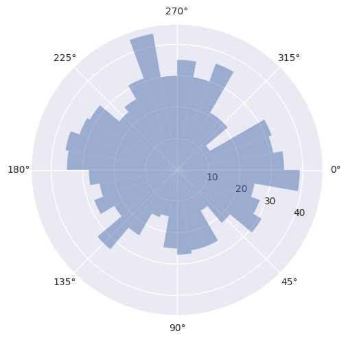
So what does it look like in a circular histogram?
[4]:
seq = Sequence.generate_random_normal(n_events=1000, mu=500, sigma=50, rng=rng)

plot_phase_differences(test_sequence=seq, reference_sequence=500);
Example 2: Finger-tapping data#
The finger-tapping data from this example comes from an experiment in which participants were presented with highly irregular (anisochronous) sequences of sounds with the task ‘tap along as best as you can’. The participants tapped with their index finger on a table, and these responses were measured.
For simplicity, we only look at responses in which there was an equal number of taps to the number of events in the stimulus. This is because the plot_phase_differences() function works by comparing the events sequentially. As such, we cannot easily work with responses that have missing taps.
We use pandas to work with the data. If any of the used methods there confuse you, please refer to this pandas tutorial.
What we’ll do is create a list of Sequence objects that are the stimuli, and another list of Sequence objects that are the responses. We can then element-wise compare them using the plot_phase_differences() function.
[5]:
# Load the dataset
df = pd.read_csv('sampjit_sampledata.csv')

# Take a quick look at the data
print(df.head(5))
  sequence_id  pp_id  condition  length  tempo  variance  interval_i  \
0        1_13      1  jittering      25    400       0.2           4
1        1_13      1  jittering      25    400       0.2           5
2        1_13      1  jittering      25    400       0.2           6
3        1_13      1  jittering      25    400       0.2           7
4        1_13      1  jittering      25    400       0.2           8

     stim_ioi  resp_iti
0  488.360885    329.32
1  302.385354    384.55
2  378.198490    497.05
3  448.052241    400.91
4  418.512601    378.41
[6]:
stimuli = []
responses = []

# We loop over the sequence id's
for seq_id in df.sequence_id.unique():
    # We get the relevant piece of the dataframe for that sequence id
    df_piece = df.loc[df['sequence_id'] == seq_id]

    # We create a Sequence object for the stimulus and the response
    stimulus = Sequence(iois=df_piece.stim_ioi)
    response = Sequence(iois=df_piece.resp_iti)

    # Add them to the lists
    stimuli.append(stimulus)
    responses.append(response)
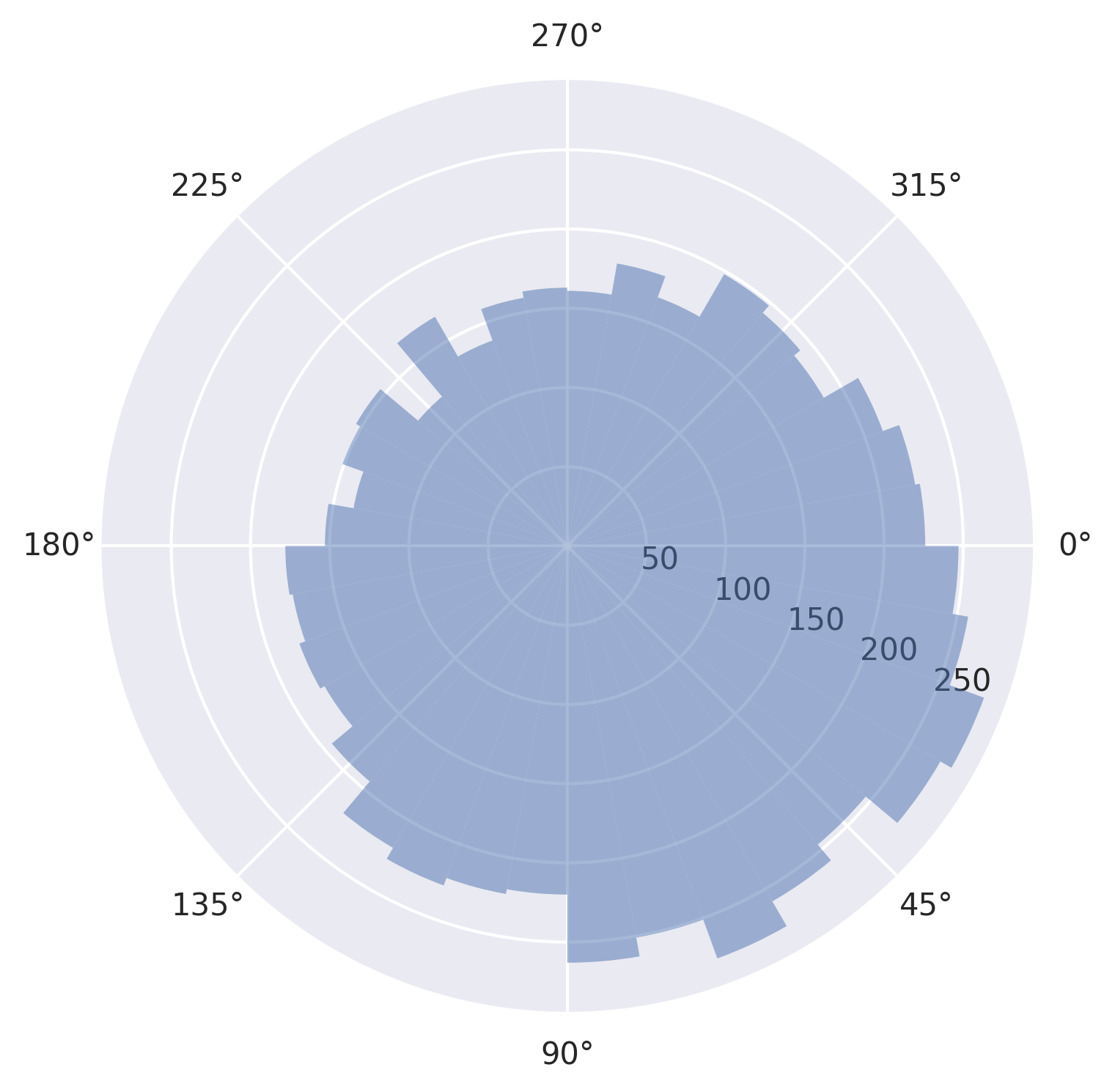
Now we’re ready to plot.
[7]:
plot_phase_differences(stimuli, responses, dpi=300);
/Users/jellevanderwerff/thebeat-package/thebeat/utils.py:203: Warning: thebeat: The first onset of the test sequence was at t=0.
This would result in a phase difference that is always 0, which is not very informative.
Therefore, the first phase difference was discarded.
If you want the first onset at a different time than zero, use the Sequence.from_onsets() method to create the Sequence object.

  warnings.warn(phases_t_at_zero)
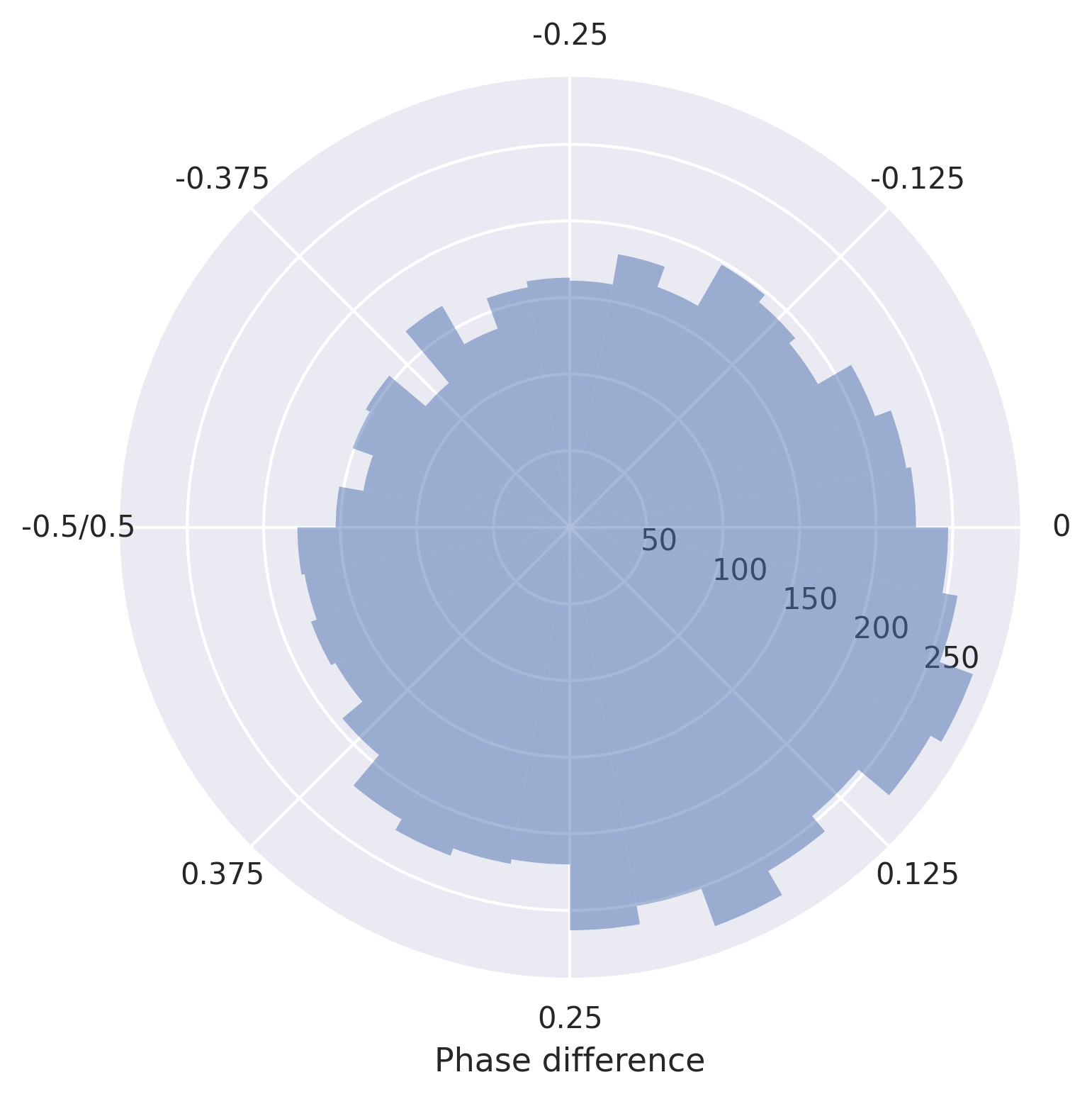
Say we want to change the x axis labels, we can do that as follows:
[8]:
fig, ax = plot_phase_differences(stimuli, responses, dpi=300)

ax.xaxis.set_ticks(ax.get_xticks())
ax.set_xticklabels([0, 0.125, 0.25, 0.375, '-0.5/0.5', -0.375, -0.25, -0.125])
ax.set_xlabel('Phase difference')

fig.show()
/Users/jellevanderwerff/thebeat-package/thebeat/utils.py:203: Warning: thebeat: The first onset of the test sequence was at t=0.
This would result in a phase difference that is always 0, which is not very informative.
Therefore, the first phase difference was discarded.
If you want the first onset at a different time than zero, use the Sequence.from_onsets() method to create the Sequence object.

  warnings.warn(phases_t_at_zero)
Adjusting and saving the figure#
The package documentation describes different customization options (e.g. setting the direction of 0 differently). You can find it here: thebeat.visualization.plot_phase_differences().
You may also want to take a look at the more general page Saving and manipulating plots.